Cute Flower Coloring Pages (Free Cozy Printables)
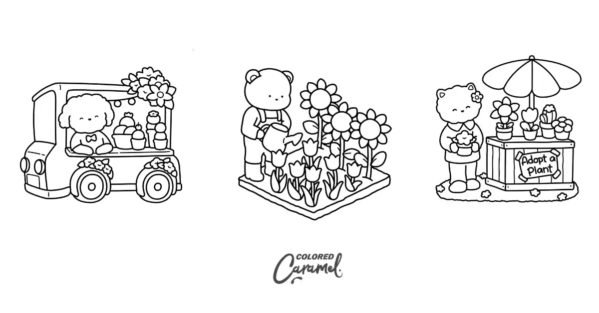
A lot of flower designs lean toward the realistic. They have tight petals and busy line work that look beautiful but ask for a lot of patience. The cute version goes the other way. The outlines are bolder, the shapes are friendlier, and the little scenes around each bloom make the page feel inviting instead of intimidating.
The first time I sat down with one of these, I expected to finish in a few minutes. Instead, I slowed right down. I spent longer picking colors for a single potted plant than I’d like to admit. I kept changing my mind about the flowerpot because every new color combination seemed to work!
That simpler style is easier to start and somehow easier to stick with. That’s the whole appeal. There’s enough structure to relax into, without the pressure of shading every tiny petal perfectly. You can spend as much or as little time as you want, and the page still feels satisfying when you’re done.
Free Printable Cute Flower Coloring Pages
Below are four free pages from the Blooming Corner book, ranging from a single simple bloom to a cozy little flower scene. These printable pages are for personal, non-commercial use only.
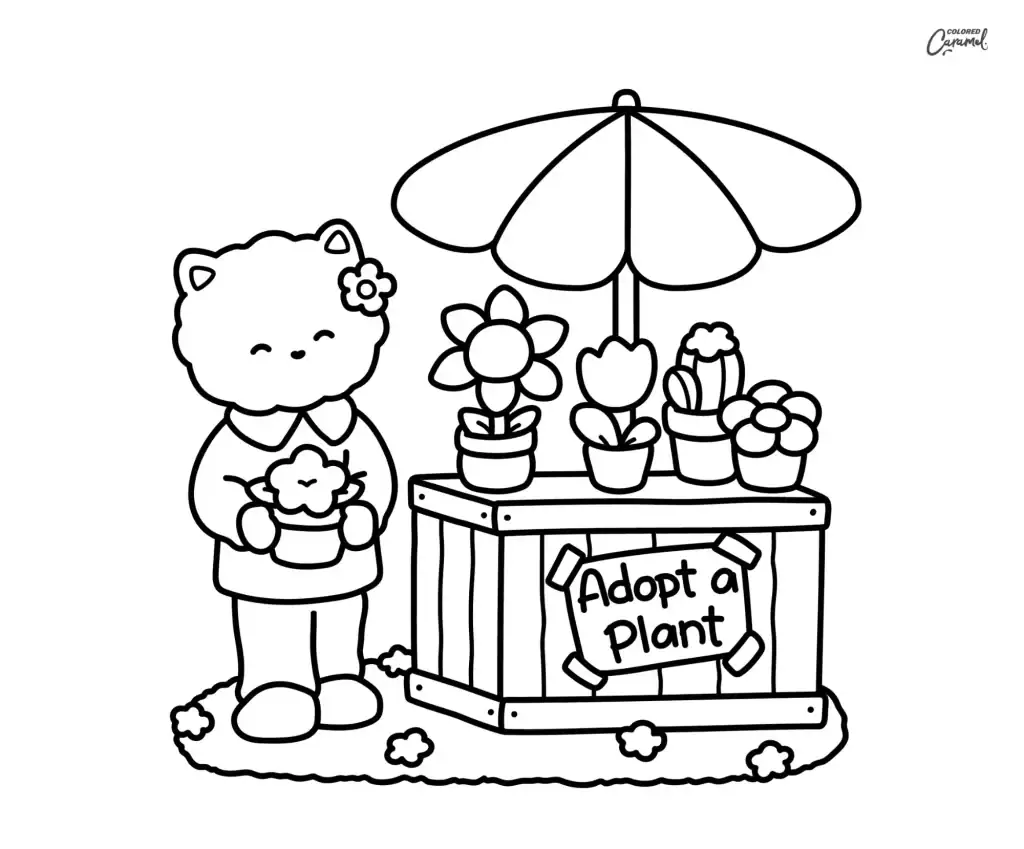
1. Kitty’s Adopt-a-Plant Stall
A smiling cat tending a little “Adopt a Plant” stall, with potted flowers and a cactus lined up under a sun umbrella.
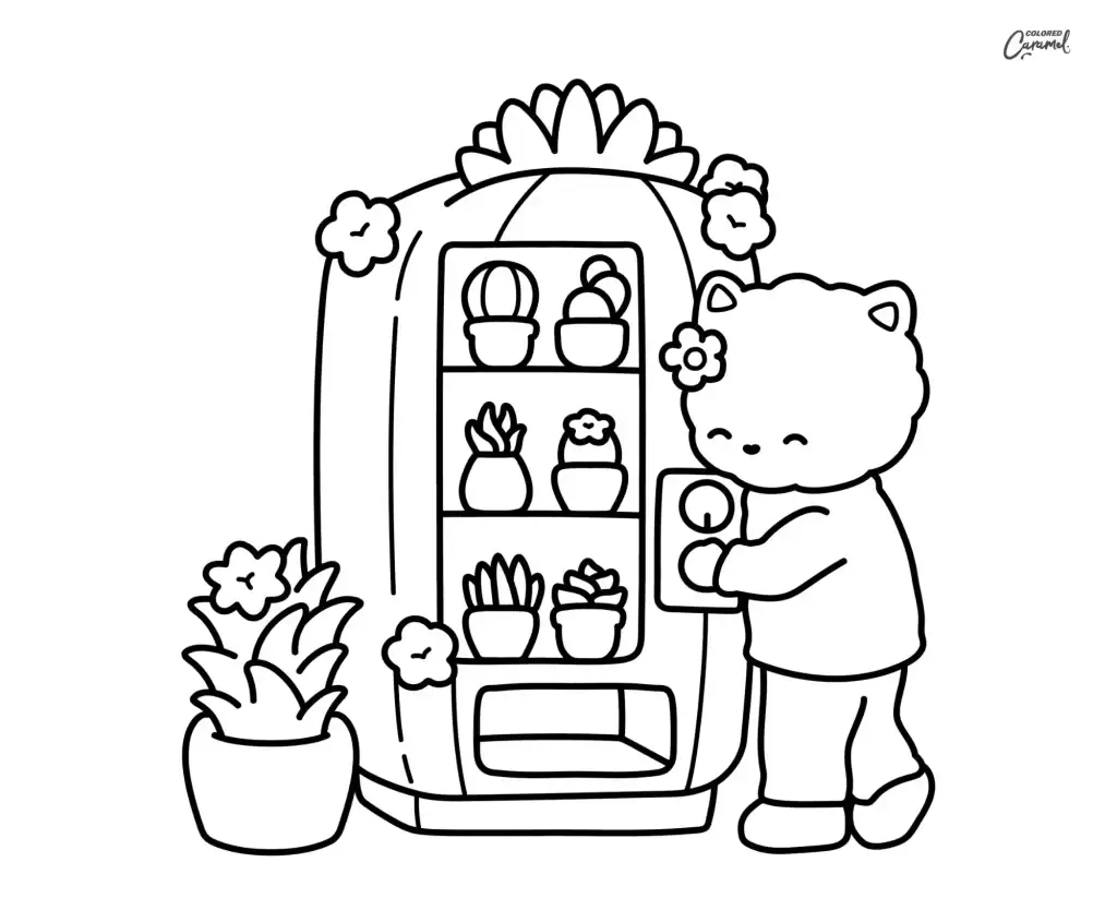
2. Kitty at the Plant Vending Machine
A cat popping a coin into a plant vending machine stocked with tiny potted succulents and cacti.
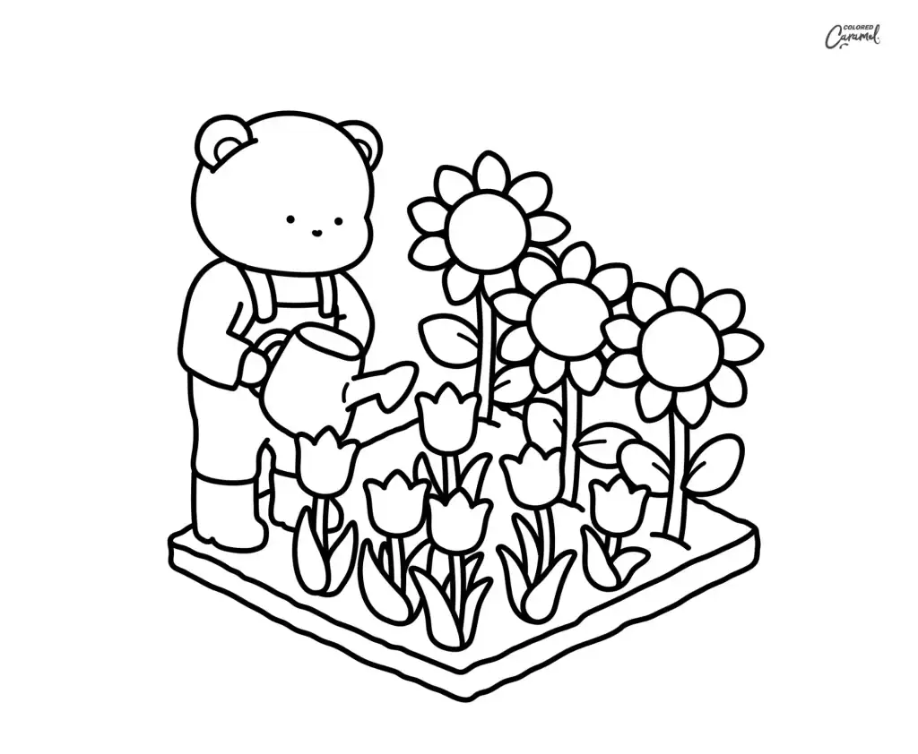
3. Bear Watering the Garden
A cozy bear in overalls watering a row of sunflowers and tulips with a little watering can.
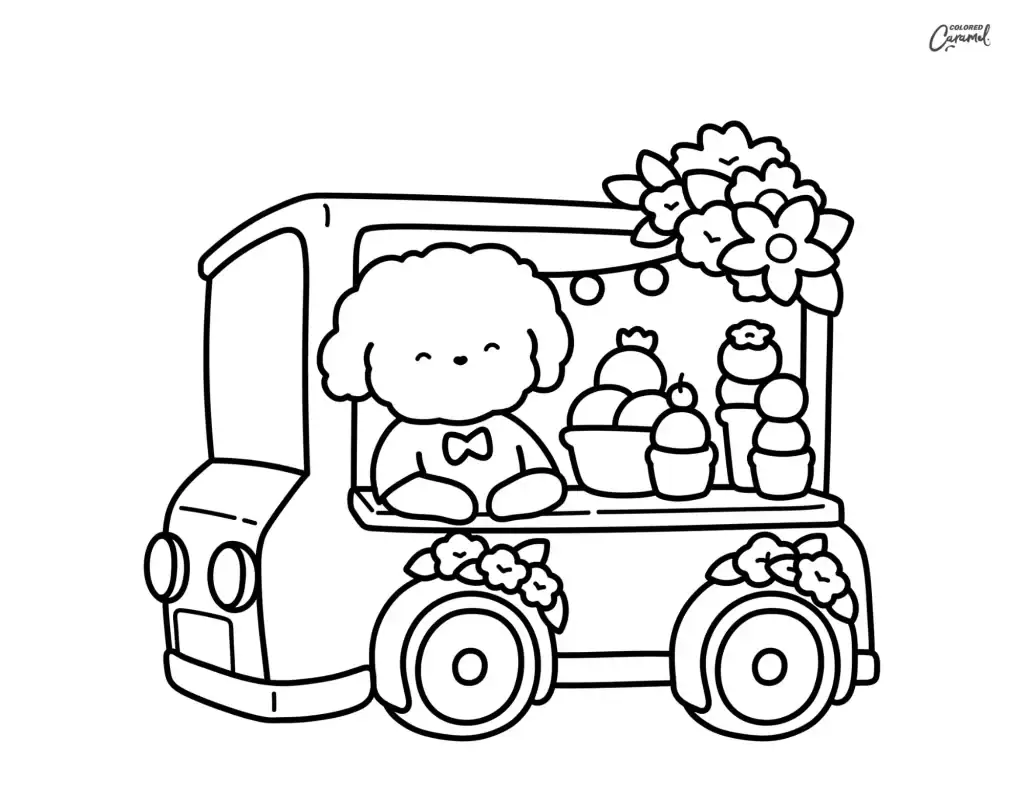
4. Puppy’s Flower Truck
A fluffy puppy running a flower truck stacked with blooms, treats, and a few potted plants.
If these feel like your kind of cozy, there are 36 more designs in the same style in the full Blooming Corner book, including flower shops, garden corners, and quiet blooming spaces not in this free set.
Some are quick and simple, others give you more to settle into when you want to take your time with color.
Browse the full Blooming Corner book
We’ve also added a short video peek at the book, so you can see how the pages look before you print.
Choose Your Coloring Style
Each page can look completely different depending on how you approach it. Some days call for something quick and simple. Other days, you want to sit longer and layer in more color.
I’ve colored the same style of page both ways, depending on how much energy I had that day.
Easy & Simple
Bold outlines and open shapes make these pages quick to start, with no real planning. They’re also gentle on little ones who are still building their fine motor skills. That might be why simple flower pages turn up so often in preschool and early school activities.
On days when I don’t want to think too hard, these are the ones I reach for. Sometimes choosing fewer colors actually helps me enjoy the page more because I’m not second-guessing every decision.
Soft & Detailed
A few extra blooms, leaves, and small background bits give you more to layer. I usually end up lingering over these pages. It’s fun to add subtle shading one petal at a time!
These pull me in longer, because there’s always one more petal to soften or shade.
Full Cozy Scenes
Complete scenes like a flower shop corner or a garden table take more time, but they’re satisfying to build up color by color. If you usually prefer realistic flower coloring pages, these scenes still give you flexibility without the page feeling stiff. I often find myself spending almost as much time on the baskets, books, or furniture as I do on the flowers themselves.
Color Palette Ideas for Cute Flowers
Choosing colors gets easier when you start with a loose palette in mind. The codes below are the alcohol markers used in the colored examples. You can match them or just use them as a starting point.
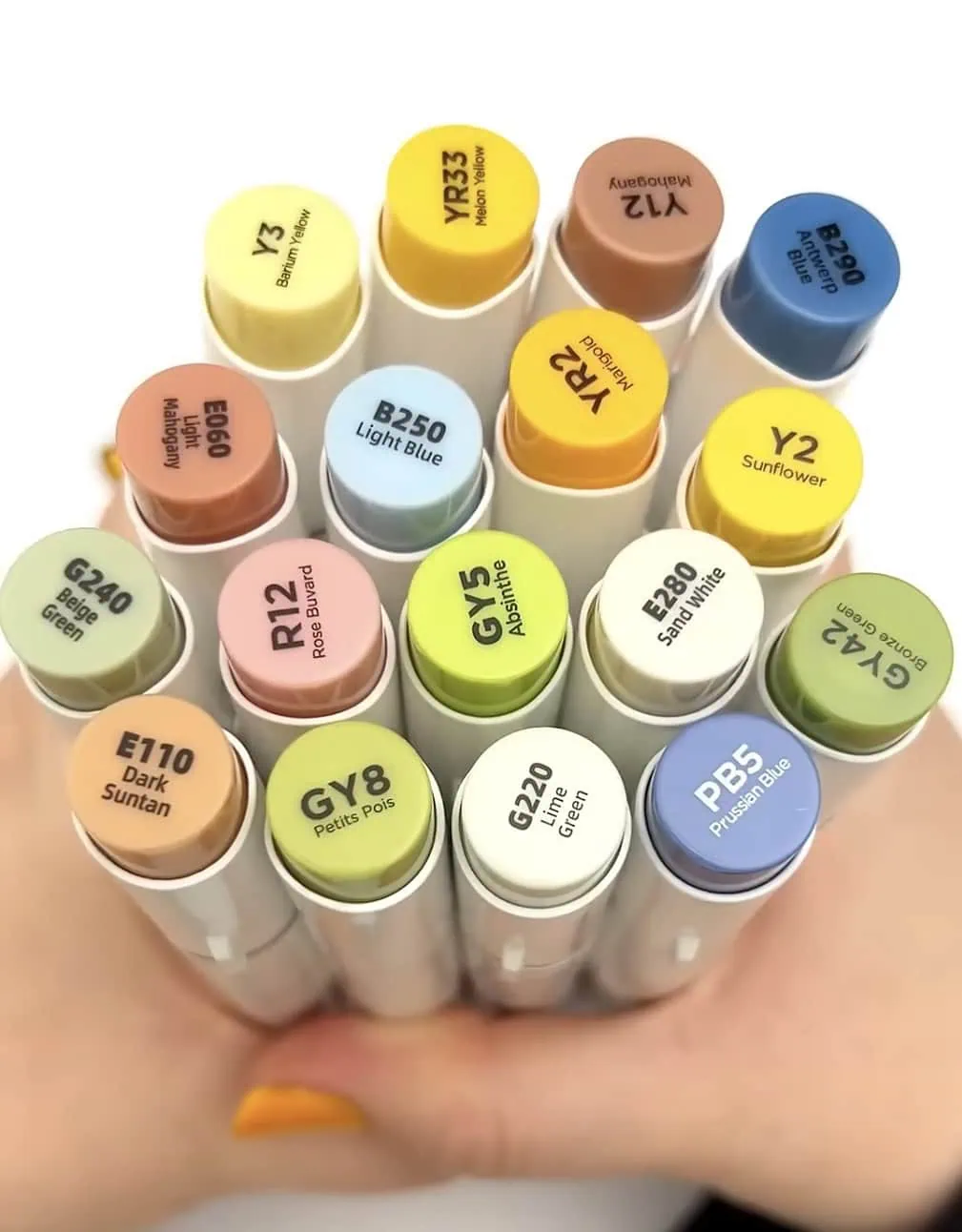
It took me a while to stop planning every color in advance. Now I usually pick three or four shades and let the rest develop naturally.
Soft Pastel Garden
Pale, gentle hues keep a page feeling airy and spring-like. I usually reach for R12 Rose Buvard for soft pink petals, B250 Light Blue for cooler blooms, and GY5 Absinthe with G240 Beige Green for the leaves. For a quiet sunny flower, a light Y3 Barium Yellow → YR2 Marigold blend is enough.
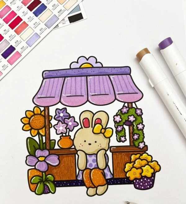
I tend to start here when I’m not sure where else to go, keeping the pressure light so nothing gets too saturated. When I accidentally overlap these softer colors, the blends usually stay forgiving, which makes experimenting feel much less risky.
Warm & Cozy Neutrals
Earthy tones give the flower-shop pages that snug, lived-in feel. The wood, pots, and baskets come alive with an E280 Sand White → E110 Dark Suntan → E060 Light Mahogany blend, with Y12 Mahogany dropped into the deepest shadows.
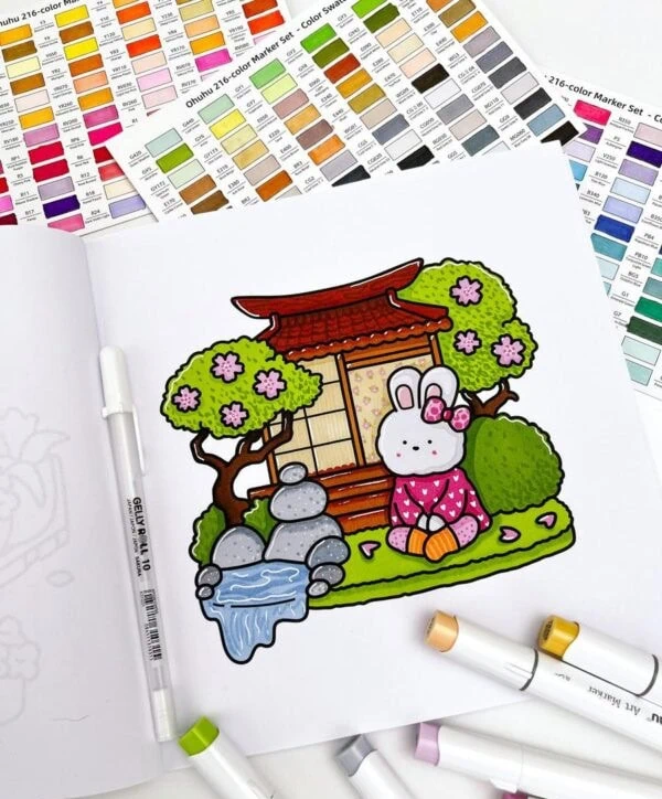
These are the colors I use when I want a page to feel calm and a little understated rather than bright. I often find myself using this palette during the fall and winter months because it creates such a comfortable, cozy atmosphere.
Bright Candy Blooms
Bold, punchy color keeps things playful, especially for simple flower coloring pages with lots of open shapes.
I go for Y2 Sunflower and YR2 Marigold on the yellows, R12 Rose Buvard for a pink pop, and PB5 Prussian Blue or B290 Antwerp Blue for bold accents.
A Y2 Sunflower → YR33 Melon Yellow blend on the petals, and GY5 Absinthe → GY42 Bronze Green on the leaves gives each bloom some depth.
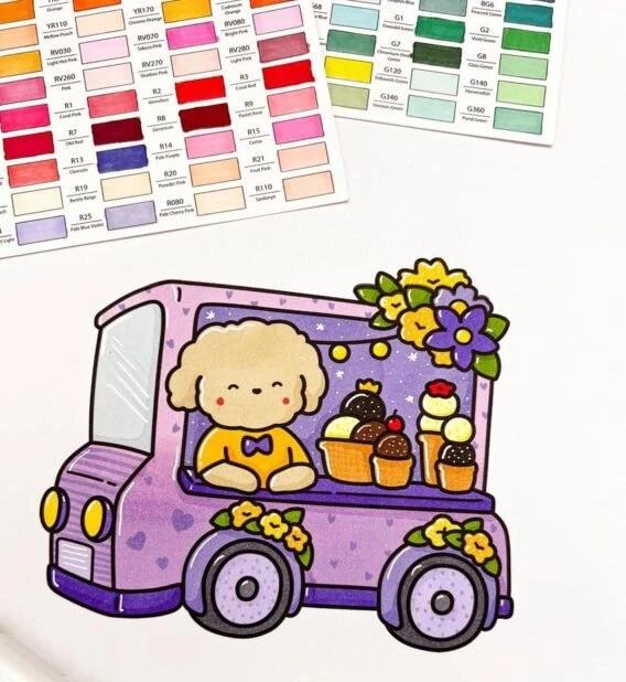
Some of my favorite pages ended up with colors I’d never planned to combine, which reminded me that flowers don’t have to follow real-world rules to look beautiful.
Tips to Make Each Bloom Look Finished
Most of what makes a flower page look finished comes from small habits, not fancy techniques. If you’re still finding your way with markers, our guide on how to blend alcohol markers walks through the basics.
Build petals in light layers. With alcohol markers, start with the lightest shade and add the darker tones while the ink is still damp. This helps the colors blend instead of leaving hard edges. I keep the first pass lighter than I think I need, then deepen the base of each petal once it’s down.
This is one mistake I made early on. I used to start too dark and quickly ran out of room to build depth. Going lighter first gives you far more flexibility.
Leave a little white space. A small highlight near the center or edge of a petal keeps each bloom from looking flat. I used to fill every gap, and the flowers ended up looking heavy. Even a tiny highlight can completely change how fresh a flower looks. A white gel pen is an easy way to add those highlights back in.
Use both nibs. The broad nib fills petals and larger shapes quickly, while the fine tip handles small petals, outlines, and lines. Switching between them mid-page felt awkward the first few times I tried it. Now I barely think about it.
Keep backgrounds simple. If a page feels empty, a few dots, leaves, or tiny butterflies fill it in without crowding the flowers. I’ve learned that stopping early usually looks better than trying to decorate every blank space.
Don’t overthink the colors. Flowers don’t have to be realistic. Some of my favorite pages used combinations that sounded odd at first, like a blue rose or an orange tulip.
Once I stopped worrying about whether a flower “should” be a certain color, coloring became much more enjoyable!
Print on slightly heavier paper. Alcohol markers bleed through thin sheets, so a heavier page keeps the back clean. It stops the ink from feathering at the edges. This small change makes a noticeable difference.
Build Your Cozy Coloring Routine
These pages work best as part of a slow, low-pressure routine, not a project to finish.
There’s something grounding about coloring flowers. It’s a calm, screen-free activity. It supports focus and social-emotional learning for younger kids. It’s a quiet reset for adults.
Even simple pages bring a bit of nature and sunshine into your life, and the repetition is calming after a long day. Sometimes I don’t even realize how tense I was until I’ve colored a bit and my shoulders relax.
I like keeping a page going on the kitchen table and adding a few petals whenever I pass by. Some I finish, some I don’t, and that’s fine. Leaving a page unfinished used to bother me, but now I actually enjoy coming back with fresh eyes a day or two later. I’ve lost track of time more than once because I got caught up deciding between two shades of pink for a single blossom.
A finished page also makes a sweet, low-cost gift, or a nice desk or shelf decoration. I’ve tucked finished pages into notebooks, framed a couple, and even used them as homemade cards. There’s something satisfying about seeing the finished colors later on.
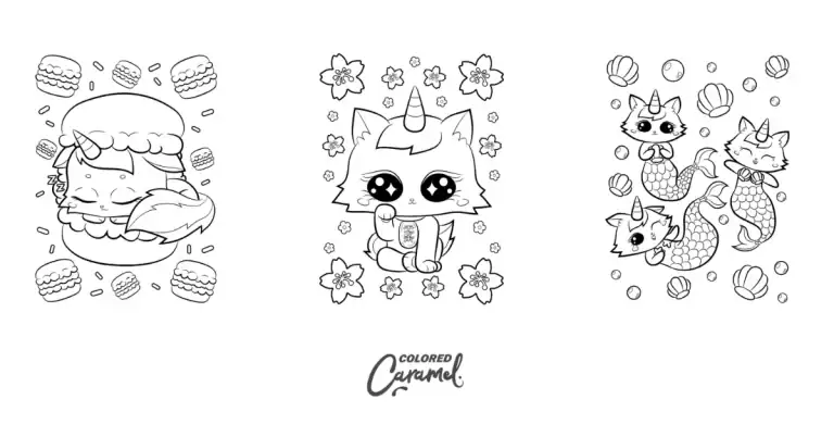
If this cozy style suits you, our caticorn coloring pages are nice to come back to whenever you want more of the same easy, cute designs.
Want More? Get the Full Book
If you enjoyed these, there are plenty more where they came from.
The free set here is only a small part of the Blooming Corner book. The full version has 40 cozy flower and garden designs, an extensive collection of scenes you won’t find in this free download.
Get the full Blooming Corner book
Key Takeaways
· Cute flower coloring pages keep blooms simple and cozy, so they feel relaxing rather than fussy.
· Four free printable pages from the Blooming Corner book, for personal, non-commercial use.
· Easy, soft, and full-scene styles suit both kids and adults at any pace.
· Soft pastels, warm neutrals, or bright candy colors all work, and flowers don’t have to be realistic.
· Light layers, a little white space, and a set of alcohol markers make each bloom look finished.
· The full Blooming Corner book has 40 designs if you want more.
Recommended Products
-

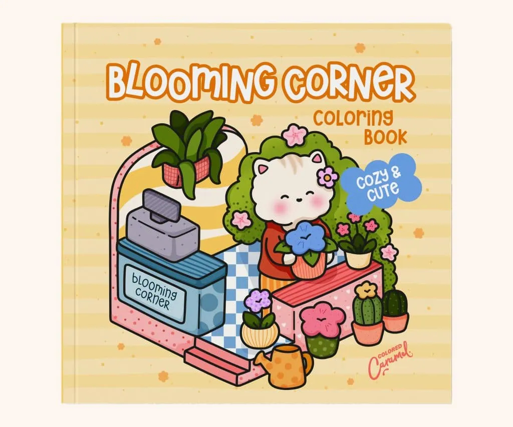
Floral Coloring Book: Blooming Corner
7.99 $ -
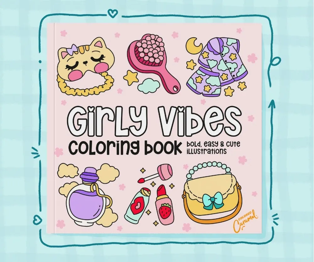
Girly Vibes Coloring Book: Bold, Easy & Cute Illustrations
7.99 $ -
Sweet Days Cute & Cozy Coloring Book: Comfy Relaxation for Adults and Teens
Price range: 7.99 $ through 9.99 $
Shop the books
Sweet Days Cute & Cozy Coloring Book: Comfy Relaxation for Adults and Teens
Price range: 7.99 $ through 9.99 $
Cute Kawaii Coloring Pages: Kawaii Daydream:
Price range: 7.99 $ through 9.99 $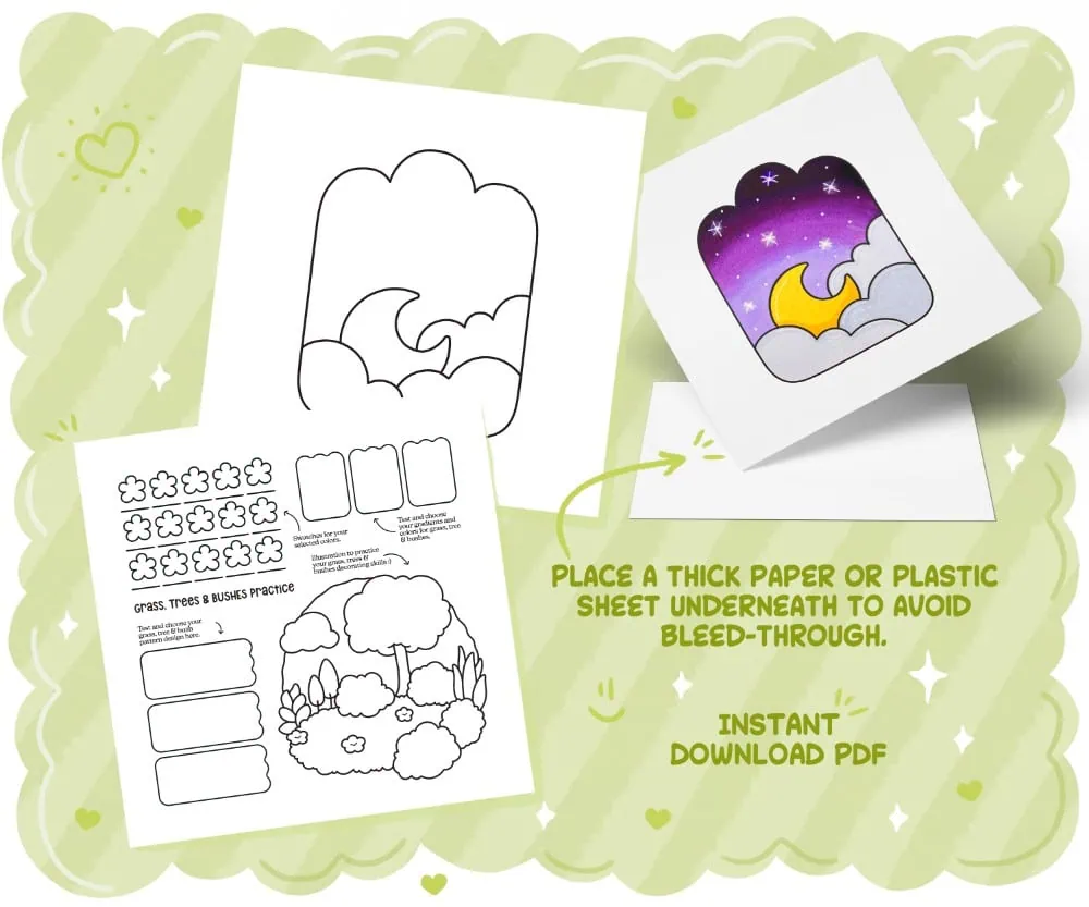
Practice Coloring Pages: Your Coloring Time Workbook to Train & Perfect Your Skills
Price range: 7.99 $ through 9.99 $