How to Blend Alcohol Markers (Without Streaks or Bleed-Through)
Summary: Blending alcohol markers gets easier once you understand how the ink moves and how quickly it dries. The paper quality matters more than most people realize, and so does choosing colors that are close in value. In this guide, I’ll share how to choose blend-friendly shades (even from a small marker set), the light-to-dark method I rely on, how I prevent streaks in larger areas, and what I do when a blend starts going sideways.
There’s something so satisfying about blending alcohol markers. When you see those smooth, velvety, perfectly blended gradients, the process can seem effortless. Colors melt together. Shadows feel soft instead of harsh. It’s the kind of finish that makes a page look thoughtfully done, even if the design itself is simple.
Then, you sit down with your own printable coloring page to try it. You add a dark color, and a harsh line shows up. Or faint streaks appear after the color dries. Or worse, you flip the page over and realize the back looks like it went through a rainstorm.
If that sounds familiar, it doesn’t mean you’re bad at blending. Alcohol based markers just behave differently than pencils or water-based markers do.
The ink moves fast; it dries fast, and it spreads in ways that can surprise you at first. Once you understand how quickly it moves (and how quickly it dries), blending becomes much more manageable, less like a guessing game, and more like a rhythm.
Prepare Your Coloring Page So Blending Actually Works
Having the right paper set up correctly determines whether your blend looks smooth or streaky.
Good blending starts before the first stroke. I learned this the hard way. The first time I tried blending a soft pastel sky, I focused entirely on the color choice. I painstakingly chose the prettiest colors without a thought of the paper underneath. When I flipped the sheet over, I was shocked. The color had soaked straight through, leaving the back warped and slightly fuzzy.
That was the moment it clicked: paper isn’t background; it’s part of the technique.
Alcohol markers contain dye suspended in alcohol, and that alcohol evaporates quickly. This allows colors to merge while wet, but it means they penetrate the paper fibers fast. Thin paper absorbs unevenly, and shortens your blending window to just seconds. That’s usually when streaks sneak in.
Use Thicker Paper for Printables
If you’re printing coloring pages at home, cardstock around 160–200 gsm (65–80 lb cover) gives you noticeably better control. The color stays workable just a little longer, which makes soft blending easier. That tiny bit of extra time makes a bigger difference than you’d think.
On regular printer paper, I’ll sometimes hear the nib give a tiny squeak and see the ink spread a little wider than I meant it to. That’s my hint to slow down or grab a better paper. It usually just means the sheet is soaking things up too fast. It’s a small thing, but once you notice it, you can’t un-hear it.
If thicker paper isn’t an option, no worries. Keep your blends smaller and softer instead of going for big, dramatic fades. Honestly, those gentle transitions often look prettier anyway.
Always Place a Protective Sheet Underneath
Alcohol markers bleed through most paper. That’s normal behavior for that medium, not a mistake.
Sliding a scrap sheet underneath every page protects the surface below and prevents an accidental color transfer. In double-sided coloring books with thin pages, heavy blending will usually ghost onto the back. In those cases, I stick to soft-edged shading rather than deeply saturated gradients.
Do a Quick Swatch Test First
Before committing to a large section, test how the ink behaves on that specific sheet. Verify how long the surface stays glossy (that shine means it is still blendable). Determine how far the color spreads and how it actually looks once it’s dry.
It only takes a few seconds, but testing often saves time and frustration later.
Choose Colors That Blend Smoothly (Even in Small Marker Sets)
Blending works best when your colors are close in value.
“Value” simply means how light or dark a color is. Even two pinks can clash if one is much darker than the other.
Sometimes a pigment leans warmer or cooler than the cap suggests. I used to rely solely on the cap color. I’d think, “These look close enough.” Then they’d hit the paper, and suddenly one looked almost brown next to the other. That surprise used to catch me every time, so now I aim for gradual shifts.
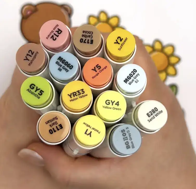
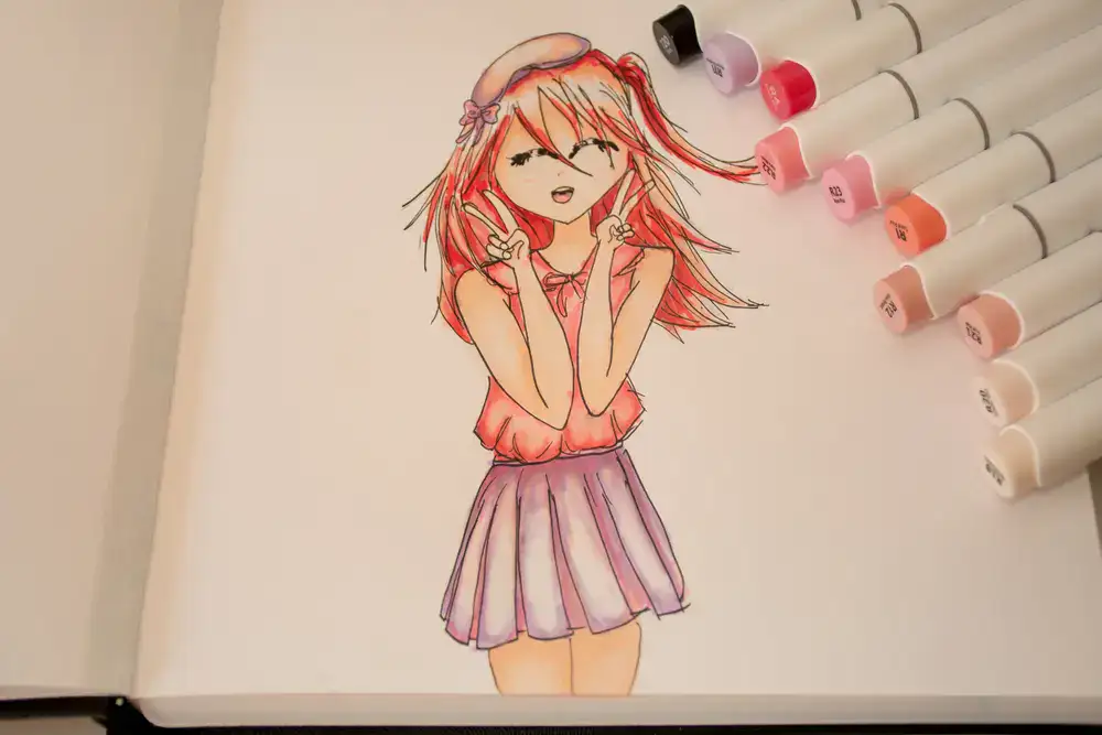
For example, the image above shows different colors of markers from my collection of Ohuhu alcohol markers, and here are the ones that will blend smoothly together.
Yellow blend: E280 → Y1 → Y12 → YR33
Yellow-green blend: Y1 → YR33 → GY4 → GY5
Grey blend: MG020 → MG060 → BG105
Pick 2-3 Tones in the Same Family
A pale pink, a mid-tone blush, and a slightly deeper rose usually melt together easily. You don’t need a massive collection.
Even a small 12-pack works beautifully when you look for subtle differences instead of strong contrast. It’s less about quantity and more about closeness.
Use a Mid-Tone as a Bridge
If two shades feel disconnected, slipping a middle tone between them often softens that transition instantly. That little “bridge” shade can erase the harsh line that shows up when distant colors try to meet head-on.
When You’re Unsure, Go Lighter
When I’m unsure, I go lighter. And, actually, I’ve never regretted it.
You can always add depth to shadows. You can layer on more pigment. But once something goes very dark, softening it takes a lot more effort, if it’s even possible.
I’ve learned to build shadows slowly. Gentle depth often looks prettier than dramatic shading.
Use the Light-to-Dark Blending Method Step by Step
The easiest way to blend is to layer from light to dark, then gently blend with the light color.
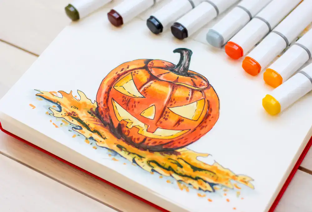
This method is reliable because it works with how alcohol ink naturally behaves. If you’d like to see this technique in action, we have also added a quick video demonstration of how the light-to-dark blend looks on paper.
Remember: you can always deepen a shadow. Pulling it back is much harder.
Step 1: Lay Down a Light Base for a Solid Foundation
Fill the first layer with your lightest shade. Keeping the area smaller than you think you need keeps it manageable.
If the surface still looks slightly glossy, you’re in a good blending window. Once that shine turns fully matte, though, the blending window ends and the color has set. That soft shine is your cue.
Step 2: Add the Dark Where Shadows Naturally Fall
Place the darkest colour along folds, edges, or where objects overlap. I used to go heavy right away because I thought bold shadows looked impressive. Mostly, it just made blending harder. Subtle almost always blends better.
The key? Start small. You can always add more.
Step 3: Soften With the Light Marker
Before the area dries completely, go back over the seam using small circular motions or short flicks.
You’re gently encouraging the colors to meet (not scrubbing the paper), and waiting too long between layers usually leaves a visible line. If you move while it’s still glossy, they melt together much more easily.
Blending Large Areas Without Streaks
Control the drying time and stroke direction to prevent visible stripes.
The biggest trick? Pacing.
Instead of experimenting with the whole area at once, I blend one section and slightly overlap into the next so there’s always a bit of wet pigment connecting them. That “wet edge” is what keeps lines from forming between sections. Think of it like keeping a tiny bridge of moisture alive between passes.
Divide Big Areas Into Zones
Also, try to work in small sections. Blend one section and slightly overlap into the next so some of the surface stays wet and the ink remains active. A “wet edge” simply means some of the pigment is still capable of merging with fresh color. If each section dries separately, faint lines often appear.
I’ve tried coloring an entire background in one go before, and it felt like a race against the clock that I couldn’t win. Now I don’t even try to work quickly.
Change Your Stroke Direction
Stroke direction also matters more than it seems. Straight back-and-forth motions can leave faint striping that only shows up once it all dries. Small circular strokes or soft flicks usually dry more evenly.
It might feel slower, but it is worth the extra minute.
Fixing Streaks After They Dry (Without Making Things Worse)
If streaks appear after drying, lightly go over the area with a mid-tone and soften gently, using small circular motions. Add a little at a time. Less really is more here.
Adding too much pigment at once can create blooming, which are those cloudy patches where pigment pools unexpectedly. Small corrections usually blend in better than dramatic ones. Big fixes often create bigger problems.
Fix Common Blending Mistakes
Most blending issues are fixable, especially if you catch them early.
Mistakes feel dramatic in the moment, especially on a page you love. Fortunately, many are manageable with quick, controlled adjustments.
Harsh Lines Between Shades?
Use the lighter marker to flick gently into the darker area. Pulling light into dark keeps the correction controlled. Pushing dark outward usually spreads the shade further than you planned.
Muddy Colors
Muddy colors often happen when values are spaced too far apart or when an area is overworked long after it dried.
Complementary colors (like pink and green) can also neutralize each other if layered heavily. A middle tone often restores clarity.
Shadows That Feel Too Dark
If a shadow looks heavier than planned, layering the lighter shade over it can reduce contrast. Alcohol markers don’t erase pigment, but lighter layers can usually soften contrast. That’s why building gradually works so well.
Coloring Outside the Lines?
A colourless blender can gently push small mistakes back toward the colored area while the medium is still workable. It moves the pigment; it doesn’t remove it.
And truly, most tiny imperfections disappear once the entire page comes together. I’ve stressed over details before that I couldn’t even find the next day. Zoomed out, everything looks much softer.
When Full Gradients Feel Too Intense
You don’t always need dramatic blends to create depth.
Full gradients aren’t always necessary. Sometimes I’ll lay down a base color, slightly deepen the edges, and leave the center mostly untouched. That alone creates gentle depth without over-saturating the page. On thinner paper, this approach actually looks cleaner.
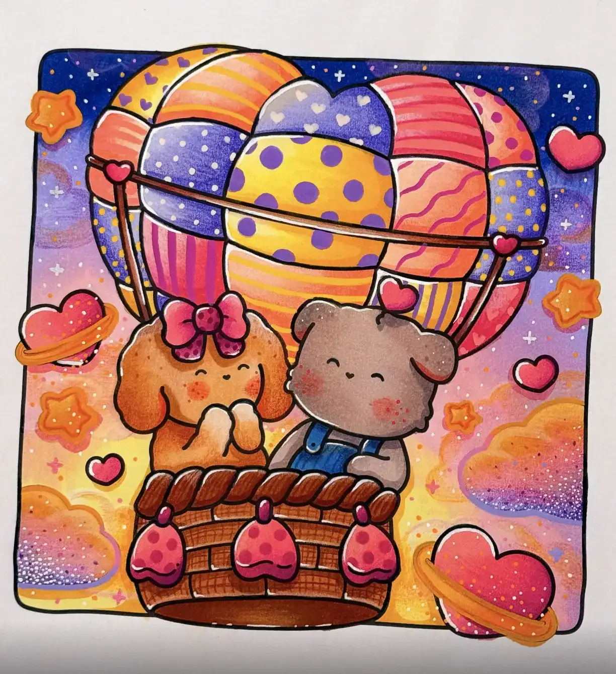
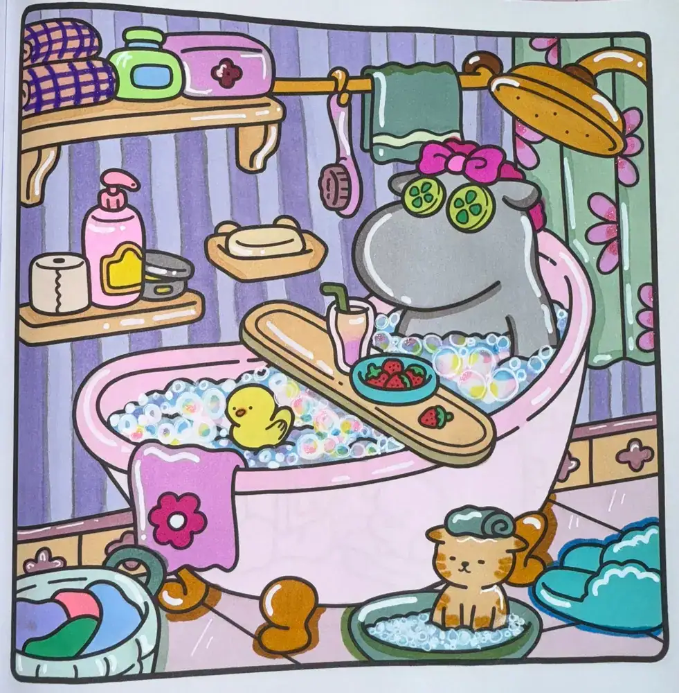
On delicate or pastel-themed pages, subtle alcohol marker blending techniques often feel softer and more polished than bold, high-contrast gradients. They give that soft, storybook feel without overpowering the overall design.
Build a Calm Practice Habit
Short warm-up exercises before starting can noticeably improve your control.
Before starting a full page, I sometimes draw two or three small gradient bars on scrap paper. It’s like a warm-up stretch for my hand. It helps me settle into a comfortable rhythm, especially if I haven’t colored in a few days.
Limiting yourself to two or three shades per session can also make the process feel lighter and more enjoyable. Fewer decisions, more flow, and less second-guessing.
Coloring is meant to feel calming. Let blending support that instead of turning into something stressful.
Key Takeaways
Smooth alcohol marker blending depends more on paper, timing, and gentle color spacing than on brand or price. Use thicker paper whenever possible and protect the sheet underneath. Choose tones close in value and blend them while the pigment still has a slight shine.
Work in small sections and build shade gradually to prevent streaks. Most mistakes can be softened with careful layering or a colorless blender. Subtle shadow blends often look cleaner than dramatic gradients, especially on printable coloring pages.
Once you understand how the ink moves and dries, blending feels calmer and more predictable.